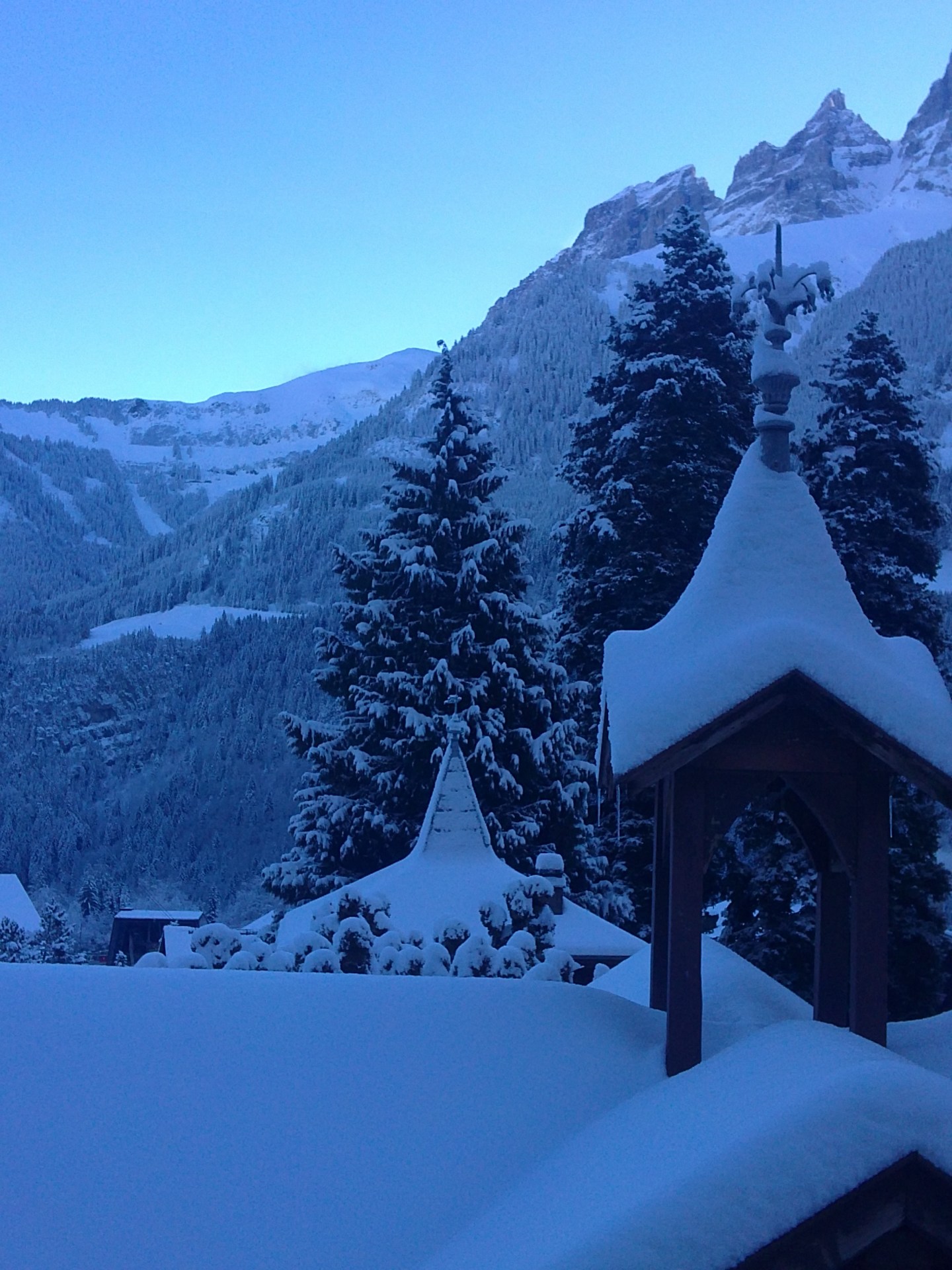
Rockwell Kent lived through most of the 20th century. He was one of the very few American artists who were not only “allowed” but welcome in the Soviet Union. He was sympathising with communist ideas, survived through McCarthyism but did not live to see the demise of the USSR. When I was a kid, my parents took me to his exhibition in Moscow. I was forever rockwellkented by his blue snowy plains and mountains. His blue is like Klein’s blue: so special, it should be patented. No photograph can adequately deliver that blue. It should be seen live.


Sometimes, I go out in the morning and, wow, I find myself in Kent’s world, just like in the photograph above. No filters, no photoshop, just blue snow. So vibrant blue, no photograph can represent it, it can only help me remember how blue it was.
Do you have a colour or a shade that would be linking up to deeply personal associations?
If not, it’s good to have one, because your eye will be so much delighted when you see it in nature. It is like finding a treasure chest.
PS One other thing: Matisse would love the photo above because it is all about his three faves: sphere, cone, and cylinder. There’s more on Matisse here, if you missed the 3D landscape post.

I guess I have one (at least) color. It’s the color of summer sky before storm. It’s orange-grey-blue, kind you look at it through the brown bottle glass. And green leafs also get some warm and saturated color then. Why do I like it? Cause all shades are very warm and one can even feel safe thanks to the very law sky. But you know for sure the storm is coming and you feel very excited about it, feel with your stomach. Сool! Believe it’s all about me))
That sounds really sexy ) Fifty shades of grey )
Can’t stop laughing) Yes, it does, esp given this hour, I should think about it more now, lol))
Didn’t read but someone gave me this book long ago
“Someone” approached you in the street, gave you the book and disappeared in the crowd? Amazing story 😉
Just don’t remember. I thought it was one girl but now I doubt cause she is too young and innocent for this (I googled the book). Probably it was someone from my past work))
You understand that “someone” from your past work is probably a very devious person? ) And I’d really love to know who that was!
someone from there is devious indeed))
A color. A few came to mind. Not one more than another. Is it possible to be drawn more to contrast than color? Is it possible to find more allure in depth and pattern than color? There are times when I believe I see better in black and white, and sometimes think there are few photographs more beautiful and poignant than those captured as such.
That being said, I seem to go through phases. I am drawn to one color until it its phased out, played out, and cliche in my own mind. Then I happen on another, ect, ect, ect.
I am not saying that anyone must choose a colour and stick to it. No, of course not. Colour conflict is so much more interesting, or the conflict of no-colour, just bw. What I am saying is that sometimes, a colour – or rather its specific shade, found in a painting or life – becomes emotionally charged beyond its “general” meaning. It is nice to have such a colour (or a whole palette of them) that delivers you a bunch of individually-charged associations. Rothko believed that colours have power similar to that of a great book, because as you look inside a colour field it reawakens so much of your personal experiences and associations that you emerge from that viewing a changed person. He protested against critics interpreting his paintings because he thought their meaning should be different to different people ) Ok, that’s the problem with me. I start answering a question or reacting to an idea and wander off ) Thanks for your clever comment!
No no. I didn’t get a sense of wandering. I am very provoked by your posts. I went out shooting this evening, and thought about colors. I realized I need to think about this more. Cool shades, warm shades… they each have a different effect on my mood, thought, feelings. I have just never ventured to put a name to that emotion. From your description, I can equate it to the way a particular scent may stimulate the memory, regenerate lost feelings and memories….
Yep. You’re right on the spot with the scent analogy! )
These are beautiful paintings and a beautiful photo. Thanks for reminding me about Kent, I unforgivably forgot him for a while. As for ‘personal’ colours – mine is green, all of its billions of shades, tints and tones…
given that we are in the middle of a winter, I sign up for the green too ) But do you have a specific shade that has a bigger or deeper meaning?
Yes, I do. It is kind of “grass green” it has a calming effect on me, always gives me a feeling of nice summer afternoon and all the lovely things connected with it… Also reminds me of being a kid and going ‘zemlyanika’ picking in the woods. Weird association, I know!