 Once, I used this chart to explain three cornerstone requirements for an artwork to be appreciated by the public. It must grab attention, be easy-to-understand, and send across a relevant message that will switch on neural processes in the mind of the viewer leading to the appearance of memories, thoughts and ideas, which are to be followed by an emotional arousal.
Shakespear believed brevity was the soul of wit. Perhaps, in the written language this is so, but in the visual arts brevity is first of all the trigger of grabbing attention. A modern man is getting too much information to want to be distracted by unnecessary detail.
Graphic artists strive to minimise the number of colour areas and to simplify lines, mercilessly wiping out superflous details.

We don’t need to see everything to construct the required image in our mind. There are only 2 black forms in the drawing below, but they produce a complicated image of a face.
You also may notice the main black form resembles a big-nosed guy paying a large saxophone. It is very likely that was the artist’s intention.
The same principle applies to photography, especially its graphic, black and white category.
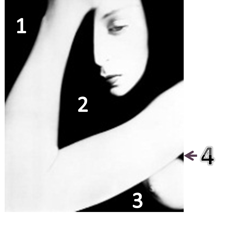
Look at this photograph by Billy Brandt dated back to 1952:
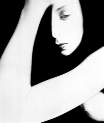
In graphical terms it took him 4 black smears or shapes/forms to define the picture, and, perhaps, he could get away with using just three.
In 1958, Billy Brandt used just A SINGLE black form to tell a story:

The main difficulty here is to identify (and exclude) details that are unnecessary to arrive at an image capable of sparkling viewers’ personal associations and keep or magnify details that are important.
A modern viewer doesn’t like too much detail: they are, perhaps, relevant to the artist, but hardly to an average gallery visitor. The complete absence of detail makes a work of art too general, and hence, not able to pick at the viewer’s personal “strings of the soul”, or, to be more precise, networks of neurons in the brain.
It is a very fine balance between creating an image that would be too generalised and hence empty of personal associations (“a woman”, “some woman”) and arriving at a depiction of something so detailed (“this is a man I don’t know, and no one I know wears a watch and tie like this”) that it also becomes a bell that can’t ring.
This Head of a Girl by Victor Dynnikov is a very good example of generalising the concept of a little girl who is over-cared by her mom (or grandma) and is – most likely – not happy about it:
The necessary detail: the striped hat, the puckered lips.
Brevity: our brain builds the striped hat out of stripes. The hat itself if not shown. There are only THREE large colour areas (besides the hat’s stripes). The girl’s hair and the collar of her coat are merged into a single shape.
I have seen a very personal resonance of this image with people in Russia.
Does it talk to you?
Among Dynnikov’s graphics works I have seen recently, I especially liked this brevity-is-the- soul-of-wit piece:
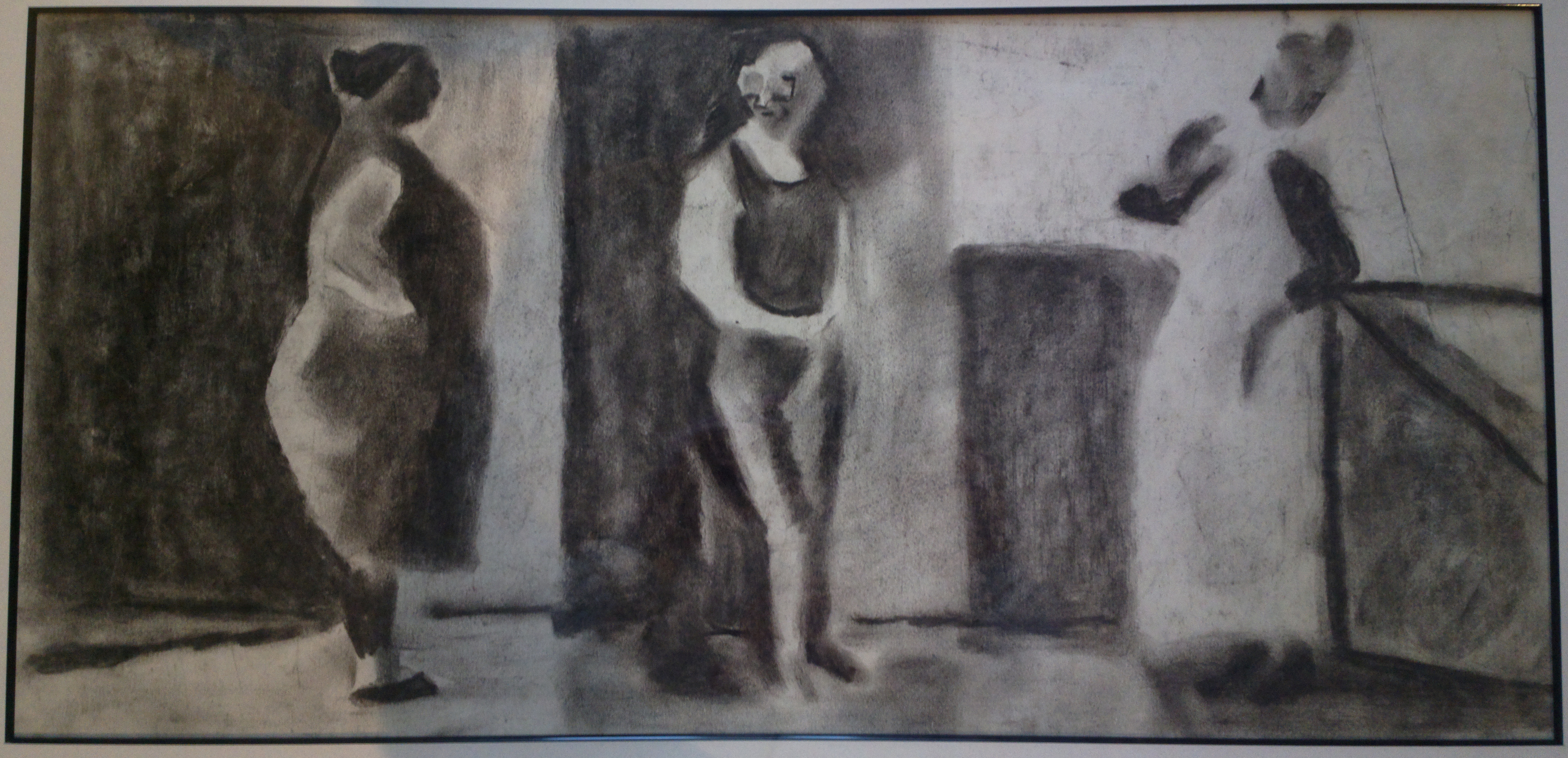
Two women and a man. This drawing is composed simply, but offers a lot of storytelling, with only a few shapes and very limited detail.
Can you gess to which woman the man in the middle is closer related?
I plan to share a few more “brevity is the soul of wit” images – in the meantime, let me know if you especially love any of this kind of images, send me a link, and I will have it referenced next time.
PS There is a strange kind of kinship between the graphics above and this photo:

Beatifully articulated post.
Re: Dynnikov’s graphics…I’m fascinated. It’s a fraught moment…torn between two lovers. Arms akimbo to the left is the wife, ticked. On the right is the mistress definitely looking like she’s in charge. The man is waffling; head (brain) looking towards the wife, body (heart etc.) tilted towards the mistress. Fearful of the wife but turning hesitantly, not decisively, to perhaps his future?
Thank you! Nothing makes me happier than insiration felt by my readers, that is in the blogging part of my life, of course. I am sure you will enjoy some other Dynnikov’s works that I posted before and after this article.
I am thrilled by your take on this particular work, really.
Excellent!
Thank you! I am glad you liked it )
Here is something on brevity from me:
I am sure you know Marina Abramovich’s story, but the details below are for readers of your blog who might not.
The man is in the video Ulay, with whom she shared a great love story in the 70s. Together they performed art out of the van they lived in, forming a collective called “the other”.
When their relationship had come to an end, they went to the Great Wall of China to walk it together. Both started walking from the opposite end until they met in the middle for one last big hug before disappearing from each other’s lives.
For her 2010 MoMa retrospective, Marina performed ‘The Artist is Present’, the biggest exhibition of performance art in MoMA’s history.
During the performance, Marina shared a minute of silence staring into the eyes of a complete stranger who was seated in front of her. This is when Ulay arrived, without her prior knowledge.
Wonderful moment. Thank you. I’ve never seen it before. Sent me thinking and revising my attitude to MA.
I used to have an attitude to MA (and performance art in general) but after watching her stuff on YouTube the MA bit changed. The key is to watch her rather than read about her. It’s worth taking the time.
I have been coming back to that moment a few times in the last couple of weeks, revisiting my view of MA. You know, I am beginning to think that her art may be just like the art of a sculptor who spends 20 years to chisel out a masterpiece. Except that she never knows if and when her climax masterpiece is going to manifest itself. I am getting more curious about her performances, that’s for sure – so thank you again for the link and your thoughts!
I am so glad to read this! Interesting analogy with sculpture. As someone who tries to make art, I see MA’s work as absolute and total immersion. Art making requires immersion – in her case immersion IS the art. Also she is unsurpassed in the clarity of her thinking and solidity of her ideas – no fluff and BS, which is not the case with most performance artists.
Interesting stuff – thought you may like this also http://bentartuk.wordpress.com/2014/01/29/the-edge-working-at-the-perimeter-of-actuality/ I wonder where we draw the line with detail? Is it Painterly detail or attention to detail or is there detail in the artist’s drive, focus and passion that led to the artwork being created? Should the artist bear the viewer in mind or is this likely to bias the original intentions of the work? Something to get us all thinking…
I am sorry to get back to you so late. It is a wonderful comment and I remember it got me thinking when I read it. Alas, I didn’t write up my thoughts then. I don’t think the artist should bear the viewer in mind, that is, INTENTIONALLY. A good artist always bears the viewer in mind, always pinches the nerve of the society simply because his or her thinking accumulates the societal pains and joys and issues and comes up with something that addresses it all in and through the creative process culminating in an artwork (and, occasionally, just in the process itself – on which Performance Art is based). Pure self-expressionism, if it is individually idiosyncratic to the artist, would hardly interest anyone (a good example is surrealistic prose that died as soon as it was born). Sometimes, the artist oversteps his or her contemporaries: the artist’s work is not seen as relevant by the public, but in a few hundred years people discover it and – boom! – it turns out the artist was a genius who could foresee issues that WOULD BE faced by people.
Oh, and one more remark. A bad artist who is INTENT on bearing the viewer in mind would usually come up with something that is best described as “cheap thrills” )
I also vote for the one on the right – and for me it is suggested by her body language – she is leaning back with coolness that borders with arrogance. She OWNS the situation , including the little man in the middle. Great post!
Thank you – absolutely loved your remark about the lady on the right owning the situation ))
Reblogged this on Storm Photography.
Beautiful painting the “Head of a Girl”. Just the necessery, not only in details but also in colour.
I suppose to the woman in left.
I think the woman to the right )))
His body is facing the woman to whom his body “belongs”. He is obviously not a part to the exchange of arguments that is taking place between the two women, he is just a witness. And the antagonistic backgrounds of the man and the woman to the left show they do not belong to the same “space”. Again, this is just my feeling )