
In my yesterday’s post, I was talking about this dramatic landscape by Ivan Shishkin, that he “invented” to represent the depression he suffered through because of the death of his young wife in a year after their marriage.
I asked three questions at the end:
- There is rhythm in this painting that makes the viewer’s eyes scan it vertically and horizontally. How is it created?
- What did the artist do to add authenticity to this imaginary landscape?
- How did the artist show he was lost and disoriented?
My amazing readers (Olga Brajnović and Anna, ) came back with insightful answers – thank you! As usual, I doctored the image to explain Shishkin’s methods.
1. Creation of rhythm

Shishkin uses dark “markers” proportioned and positioned in a way that the eye is following. I’ve marked a few in this picture to better illustrate the concept.
It is important to paint those markers in a way that would not be too obvious. A casual observer won’t realise the markers are there until they are pointed out.
To understand the vertical rhythm, I’ve maxed out contrast in this picture.
 I am sure you can see the trick without any help now, but still:
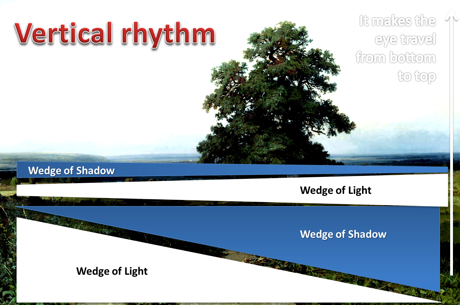
Shishkin uses interchanging wedges of light and shadow that thin out towards the horizon to create the vertical rhythm and depth.
The play of light and shadow on a relatively flat surface of the plain is justified by the skies, with its own wedges of clouds and clear skies (to better see it, I’ve killed brightness in this picture):

And these are the wedges that get “reflected” on the ground:

It is not enough to know the compositional trick, for the choice of colour value, its intensity is just as important. A less gifted artist would make this composition too obvious, and hence less believable.
2/3. Authenticity and disorientation
Most landscape artists in the 19th century used to paint something notably beautiful at the foreground, to whet viewers’ appetite for watching and studying their painting. It would look theatrical and untrue, just like in this typical work of a Dutch artist:

The plants at the foreground of Shishkin’s painting are NOT beautified in any way. In fact, he makes some of them quite withered, and thus opposed to the oak, which is lonely but full of green vitality.
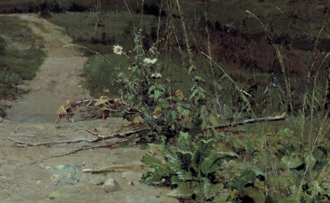
This group of plants represents blooming, withering and dying, and is linked to the artist’s emotional state as well. The road that leads nowhere and disappears in the folds of the ground is the main symbol of Shishkin’s disorientation, a simple representation of the feeling of being lost.

I learned some things from this post, even though I’ve studied art history. Thanks.
Thank you! Close to 90% of posts on art in this blog are some form of original research, never published before and, consequently, never included in art history courses )) Rants on contemporary art (not all of it, just about those parts of it I don’t like) not included, of course. Thank you for reading this post and especially for saying the nice thing you said.
I’ve had only a brief acquaintance – so far – with your blog, but I will coming for more.
Just found your blog – loving it so far!
Welcome ) and thank you!
This granted me more awareness in a delicate way.
Lovely interpretation!
Thank you! And welcome to this blog, for I am always happy to see a philosopher enjoying a bit of interpretation game )
That’s nice to hear, and thanks!
I’ve been looking for elements that adds essences both strongly and not in different kinds of arts. And your article gave me some new insights on how to achieve this. Looking forward to your future posts!
I might use some of your content in my blog later on if i find it relevant, but I’ll notify you before I’ll post it!.
A very interesting post and blog! I am glad I stumbled upon it. 🙂
Thank you, and welcome! )
Great description here!!
Thank you! Interpreting great pieces is always a pleasure )
Ah yes, the road does indeed ‘get lost’….
There’s some hope though provided by the river bend far at the distance )