In summer, Tuscan towns are all the same: any one of them can give you a heat-stroke in no time. Their palazzos facing piazzas, tiled roofs casting futile shadows down the narrow gorges of cobbled streets, faded clothes drying on lines crisscrossing the sky as if it needed mending – all seem to come off a giant 3D copier of the celestial workshop.
No one needs another few hundred files of those few dozen types of Tuscany views. Yet, it is impossible to resist taking your very own picture of your own special view of a Tuscan town.

What is really different, is the history of these towns, reflected in the art they’ve managed to hold on to, despite the best efforts of the Uffizi Gallery and overseas collectors.
We are visiting Volterra today, a town with history dating back 3000 years. Ironically, it got global fame only recently, with the author of the Twilight series making Volterra the headquarters of the oldest tribe of vampires. If you ever need an example of how good come out of bad, especially out of bad literature, this is it.

But even the Twilight fame failed to make the town a tourist mecca: it is so much off the main routes that its book stores and gallery shops do not care to carry English-language catalogues or albums (other languages do not seem to be known to exist at all).
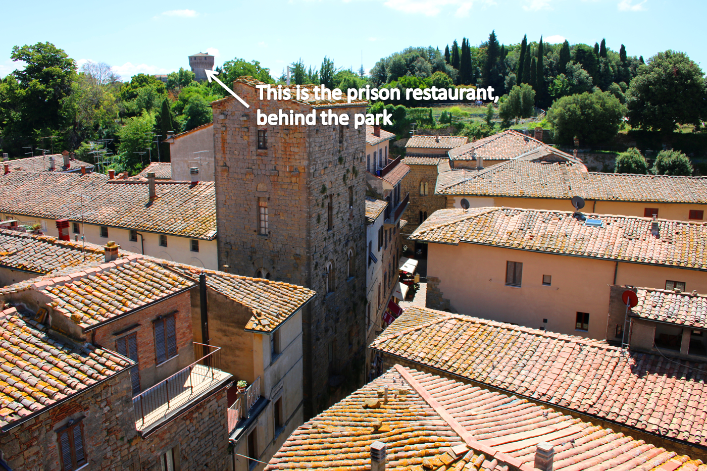
This is sad, for the town has at least six artistic jewels that could whet an art-lover’s appetite, besides the unique attraction of a gourmet restaurant in the maximum security prison housed in Volterra’s impregnable 15th century castle, offering a Michellin-worthy menu for the especially hungy.
Being served by thugs, and entertained by a pianist who’s doing life for murder must be an unforgettable experience which I can’t share with you because I didn’t go there. The restaurant requires very advance booking to allow for background security checks on prospective visitors. Security measures at the entrance are rumoured to surpass anything you might have encountered at Israeli airports.
Don’t despair though: items on the art menu in Volterra are good for a wholesome lunch and dinner too.
The local Pinacoteca has two Luca Signorellis and one Domenico Ghirlandaio that are be best seen in comparison to each other, especially the ones they painted a year apart:

The two painters were of the same age, educated by the same artistic standards and exposed to similar ideas during their youth. Yet, they evolved into very different painters, symbolically embodying the two lines of Renaissance: the decorative and the humanistic. These two paintings, that intercept them both at the same trajectory point, provide a great insight into Quattrocento ideas.
Ghirlandaio stood for the decorative line, with its childlike interest in beauty to be found in nature, and made by men; and Signorelli signed up for the humanistic party which was putting Man’s heroic nature in the focus of its artistic exploration and expression.
Ghirlandaio made his composition look like a classical temple (something that had been invented long before him), with two saints serving as columns and the Saviour positioned in the pediment.

The Benedictine monk, who commissioned the painting (which was paid for by Lorenzo di Medici), is shown in the bottom right corner, as if he is about to enter the shrine.
One should come in reverently, and the genuflecting figures provide the model of behaviour, as well as leave an opening through which one may enter.
The knife between them (which was perhaps the weapon that killed one of the two female saints) explicitly shows the way:

The idealised landscape is the promised land, an earthly version of the celestial Paradise reachable if people organise their lives according to the Christian principles.
All the colours and forms in this painting are nicely balanced to provide the feeling of emotional security for the believer. There’s no conflict, no heroism, no decisions to be taken. Repent, kneel, and don’t be afraid of dying.
Ghirlandaio didn’t become the leading painter in Florence, with the largest workshop attracting the best of the best (including Michelangelo, who was expropriated by Lorenzo the Magnificent a year before), for nothing. Decorative artists, at least during their lifetime, have always been more successful than their counterparts presenting conflict and drama in their work.
The less successful counterpart, in this case, is Luca Signorelli. He travelled Italy a lot, but in 1491, when this panel was made, he was in Florence, doing sundry jobs for the same Lorenzo the Magnificent.
A simple comparison of how the red cloaks are painted shows the difference between him and Ghirlandaio:

Signorelli creates a colour drama with each fold: a conflict between black and red. Ghirlandaio uses basically the same colour, occasionally adding an embroidered hem to boost up visual pleasure.
Signorelli (borrowing much from Flemish painters), creates a whirlwind of colours taken from the opposite ends of the colour wheel: green vs. red, blue vs. orange, purple vs. yellow, and organises them in a way that makes the eye wander through these multiple clashes in straight or circled lines. You may also reflect on the thematic difference of the two paintings: Ghirlandaio’s Savior is already high up in the sky, promising salvation, while Signorelli’s Virgin and Child are at the start of the way full of misery and pain.
I’ve traced just some of the colour directions (it is a nightmare to do on a notebook), and I am sure you can enjoy the conflict of blues vs. orange golds without any aid.
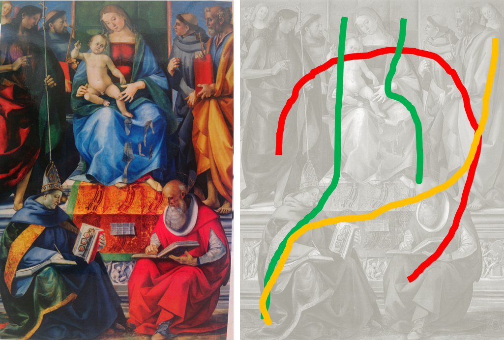
There’s no movement in the poses of the figures, everyone is serene and solemn, but there’s a lot of movement in the eye of the beholder. Is this colour solution a perfect one? No. The left side is much “heavier” than the right, because the artist used “cold” colours that are associated with heavy mass there and the red robe on the right side does not balance out the lighter right side, which makes the whole panel tilt a bit to the left.
Is this a flaw? Perhaps it is, but the artist wanted to kick the observer out of his equilibrium state, the artist was looking for creative ways to do it, and I think the overall impact of Signorelli’s work is much stronger than the Saviour of Ghirlandaio. Another serene promise of Paradise is not something that can make a believer change his ways. Signorelli wanted to punch people, and, given that his compositions were pretty much canonised or predetermined by commissioners, he was experimenting with colour to reach his objective.
This is why I believe Signorelli is quite underestimated as one of the first true colourists of the Renaissance. He was not a genius, but he was bold enough to make first steps in finding ways to use colour as a means to stir souls.
There’s something else I want to show you from Volterra, but I’ll save it for later. I don’t have a pic of the prison restaurant, but I have the prison tower here:
And while I am writing a post of yet another panel from the local Pinacoteca, street musicians provide somewhat irreverent entertainment by singing songs about Commandante Che:

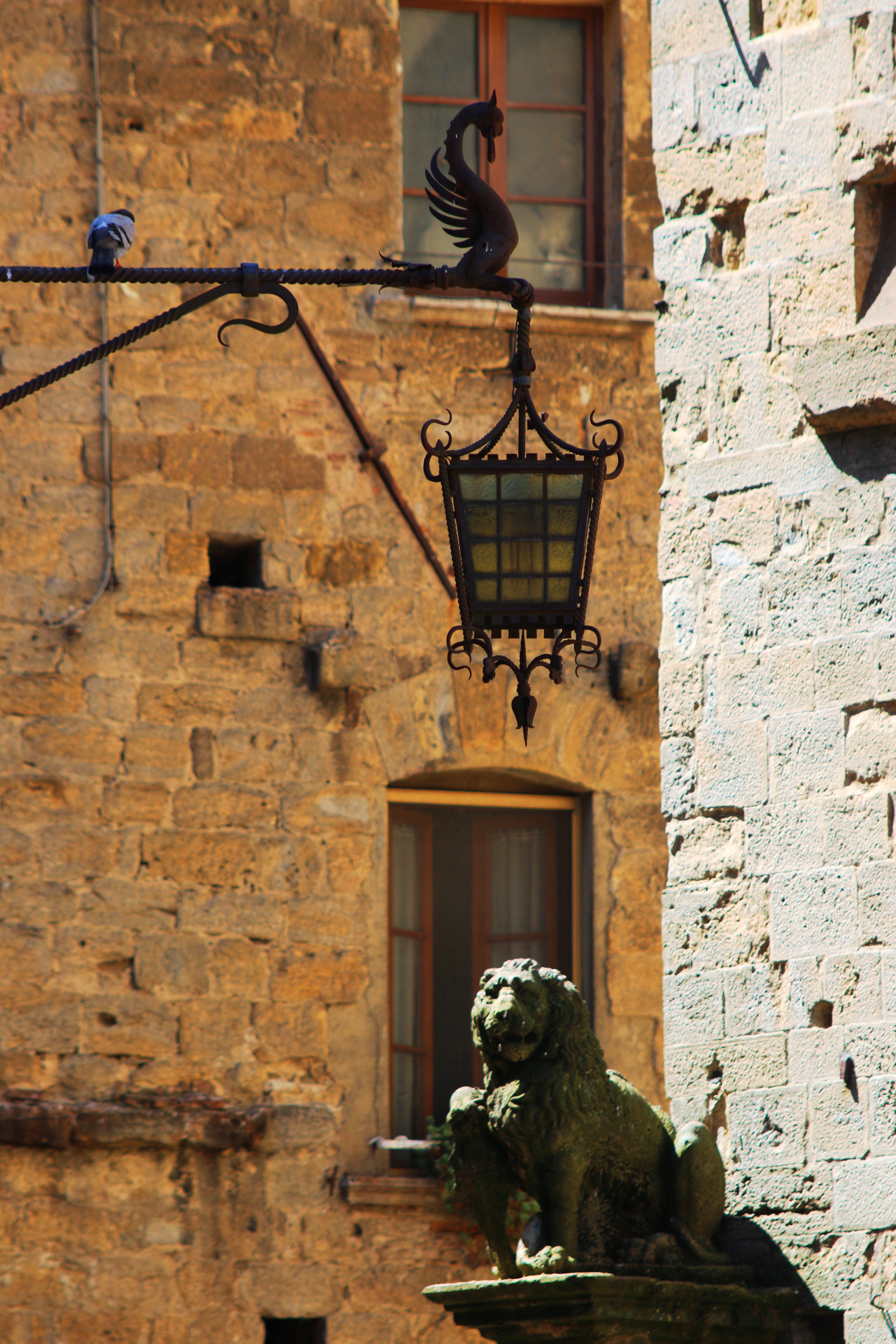
…while ancient lions and swans are watching them with the condescension of someone who’ve seen rebels turn into bourgeoisie at least a dozen times per any given century:

Nice post! Yes, Volterra deserves a visit, even if off the beaten path, in the midst of a beautiful landscape with an important Etruscan history.
Thank you – and I have not yet started writing about the Etruscan part yet – which is amazing! ))
Hey I read your blog every day and learn something new and whenever I get chance to visit any art exhibition in my city now I try to understand the art piece and the story behind. Thank you a lot for sharing this…:)
Thank you for being a loyal reader ) I am really, truly happy this blog helps you to get more out of your experience with art!
Yes indeed it helps me a lot. Keep Sharing..:)
Interesting comparison. Ghirlandaio’s piece is definitely a lot more fluid.
It is, because his lines/outlines are flowing like a grand waterfall )
Marvelous. Thank you. Missed you.
Thank you, my dear friend – there’s more coming on SIgnorelli – about his ultimate colour conflict ))