If you are too happy and need to rev down the engine a bit, visit the BP Portrait Award Exhibition in London. That’s the place that will bring you down to normality. Otherwise (that is, if your happiness gauge is not stuck in the heart-endangering zone) it will just make you miserable.
I am telling you why in a bit.
it is an international juried show, which means there’s a group of art experts who sift through a ton of anonymous submissions to choose a few dozen portraits that are cream of the cream. The best there is to savour in the portrait department of fine arts. At least, that’s the idea.
The real outcome of this sophisticated selection process makes me think that if this jury were dealing with criminals, first-degree murderers would walk free, and first-time pot smokers would be sent to the gallows.
Adepts of conspiracy theories may jump at “BP” in the show’s title. Perhaps, British Petroleum pays for this travesty because polluting the environment is not enough for these guys anymore. Too trivial, you know. Poisoning culture is way more exciting.
A good half of the portraits in this show seem to have been made with a single purpose: prove that a man can do no worse than an ink-jet photo printer. The picture below is not a photograph. This is a portrait that won the 2nd prize.

Indistinguishable from a quality photo. A single man can do no worse than a Canon camera and an HP printer combined. Mission accomplished? Wait, perhaps, this is not all there is to this portrait? Let’s hear the artist out.
‘I hope this painting conveys a sense of Eliza’s [the artist’s niece] growing confidence as she develops into a woman’, says Gaskell, ‘but retains some of the self-consciousness which was also present at the time.’
OK, I know that verbal statements of visual artists should never be taken at face value. Still.
Did she lose her self-consciousness when she became a woman? Is this something common to a lot of women that an individual case is relevant to an audience wider than this particular girl? And how do I know that she develops into a woman? I am not sure the approach of Balthus is appropriate when portraying an underage relative, but a sign, a marker of adolescence would be appreciated.
The painter said he was influenced by Hans Memling (whom I adore) and the Jury somehow decided that it’s rather Vermeerish. I find this faux art-history game of influences cute, but just don’t see how it makes it a great portrait. A lot of artists were influenced by Memling, with Paul Gauguin, perhaps, known to have been hit the strongest. But it was not the fact of Memling’s influence that made him great.
Indeed, Memling often used dark backgrounds, a similar turn of the head, a similarly exposed neck and forehead (along with a thousand other artists), but his girls would normally look a bit lower than Elize because they were portrayed praying on the side of a large religious piece. They would be somber and still, contemplating their lives, sins, and virtues in the presence of the real Madonna, their earthly beauty made all the more authentic and striking by the celestial glory they were witnessing.
If Elize’s growing confidence (confidence in what, actually?) was the real objective of the painting, why is she averting her eyes from the artist? Confident people don’t button up their shirts all they way up, and they show interest in the outside world. Confident people are curious, interested in their environment. If confidence was the subject of the painting, it was replaced by ordinary dullness.
Now, the first prize.
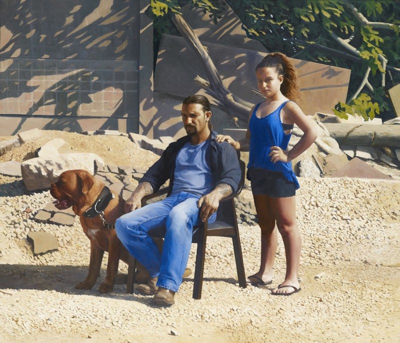
The observer is pinned down by the pensive stare of the girl, who put her hand on the man’s shoulder who stares intensively wide of the observer, while his hand touches the back of his dog who got fixated on something off to the left. The sun, the gravel, the ruin at the back speak volumes of the rugged character of the group.
Does it make me interested to learn more about these two people and their dog? Probably, yes, even though I find the painting strained, unnatural and affected. You can see the same effects in group photographs that take too much time to set up, if the photographer forgets to ask for a group “cheese!”.
What do I learn about them next? According to the NPG,
“this allegorical portrait is partly inspired by the biblical story of Jephthah, an Israelite judge who vowed to God that in return for victory over the Ammonites he would sacrifice the first thing that greets him upon his return from battle. To his horror it is his daughter who rushes out in welcome but he upholds his vow and sacrifices his child. At the centre of the portrait, located close to the artist’s home in Israel’s Jezreel Valley, is his friend Guy and step-daughter Annabelle.”
The jury must be joking. How does an incorrectly translated ancient Jewish myth about a guy who would be locked up as a schizophrenic today become the most relevant artistic achievement in contemporary portraiture?
The third prize went to a gloomy couple too.

The NPG says the artist has painted his mother Paloma and his brother Jaime in the living room of his parents’ house on a typical Sunday when the family would gather and talk. It’s great the artist’s brother would pass as John the Baptist’s double. His hands signal he is reserved, composed, and somewhat closed for business at the moment. It is also, I believe, important that the artist’s mother seems to have an expressive personality (her hands again), but looks tired and reliant upon her poker-faced son.
Perhaps the artist could shed a bit of light on how and why watching them watching me is supposed to make me go ballistic emotionally, for a prize-winner, I guess, is meant to do it.
The artist says, “‘Making this weekly event slowly disappear, I wanted to portray this emotion in my painting, with the image of my father missing and that difficult time for all of us, especially for my mum whom had dedicated herself to taking care of him. Our living room, in which we all spent many evenings together was the place that would best capture that moment.”
OK, it is a family that is about to suffer a tragic loss, and there’s also the last moment of them separating for a week, but – regardless of how compassionate the observer is – what is the emotion in this painting? Quiet tiredness? But was it worth the paint to paint quiet tiredness? I am not sure.
The Judges’ verdict was very different from the artist’s intentions. They said, ‘We were drawn to the intensity of the relationship depicted between this couple, which was assumed to be that of mother and son. There was much admiration for the loose, unfinished quality of the painting.’
Come on, guys, if you admire loose, unfinished qualities of paintings go see Nikolai Feshin, a Russian-American painter of the last century. His portraits are much more intense in terms of colour conflicts, and the way he sculpts his subjects. Compared to him, your third-prize winner is a second-grade student.
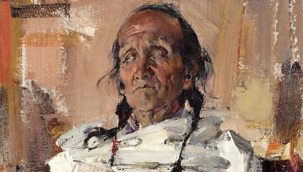
Now, I won’t be showing you the remaining dozens of bleak faces, and uninspiring bodies. There was one portrait in the show that was great, and it was this:
These are two history professors, talking.
The artist says: ‘I couldn’t follow the conversation: what I could do was to draw them, and respond to the intensity of the conversation.’
And that’s exactly what he did, but in a way that makes the observer want to join or to listen to what the two sage men have to say. Look how the spectacles of the professor on the right side lit up in response to what is being said, and created an intense light spot against the purple background, which is dark but not gloomy. Look at the complexity of folds in the shirt of the professor on the left side that goes against the smooth and cheerful surface of the other professor’s shirt. Look at their glasses on the table: very different yet attracted to each other.
All these “details” create an atmosphere you want to join, you want to bathe in. That is, of course, unless you didn’t storm out of the gallery in search of a decent psychiatrist by the time you get to this painting.
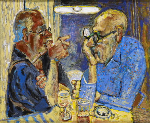
Speaking of psychiatry, there is a case that the Judges better report to a medical professional before it is too late.
This is a self-portrait. You know what the artist says?
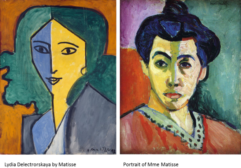
The self-portrait is by one of the artist’s alter egos, Rebekkah. Berman says of the work: ‘I am interested in self and identity, particularly the spaces we occupy both physically and psychically. Rebekkah is wearing one of her favourite jumpers. It was the jumper that inspired the portrait.’
Is her jumper really that important that it deserves a portrait? Well, I think Sara Berman, aka Rebecca, is lying. She was not inspired by her jumper. She was informed by Matisse and inspired by the multiple personalities residing in her head.
Unlike this artist, Matisse was not painting people with multiple-personality disorders. He portrayed integral individuality, i.e.people who can be calm and composed (the yellow side of Delectorskaya) or cheerful and explosive (her blue side), with the differently styled hair being an extra symbol of this. Matisse could use red in the eye (Mme Matisse), but the objective was bigger than just to show a lack of sleep.
Picasso said, famously, that stealing from other artists to create something totally new is OK. It is borrowing from them that’s not productive.
And, in fact, there is so much “borrowing” in the show, that it is depressing. Not because the portraits are all doom and gloom, but because no innovation can be found. No new styles, no new ideas.
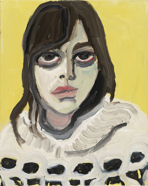
For me, this portrait (that’s the last one for today) was the highlight for this point:
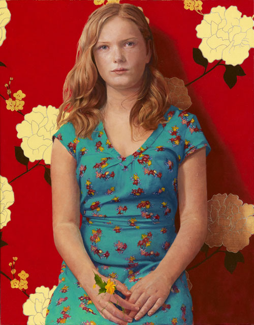
The artists’ idea was simple: he wanted to capture the final months of the young woman’s childhood as she grew into adolescence. He says: ‘Technically, I wanted to paint something colourful, but with the warm colours in the foreground and the cooler tones in the background.’
Forget that the artist here is talking like a child, and seems to be waging the old battle with a printer. The real sin here is that he borrows from Matisse, Van Gogh, and Balthus without adding anything novel or exciting. At least I don’t see it. Perhaps, someone could point it out to me? Don’t mention the flower in the hands of the girl though, a picked flower is such an obvious symbol, I feel awkward for the artist who employs it in a scene about adolescence and womanhood.
Balthus was the artist who said it all about “growing into adolescence”. He often used side lighting that would crawl over the body like a paedophile’s hand, highlighting the budding sexuality of his subject. His girls would often have a similar demure look on their faces as if saying, “I long for something, but I don’t know what it is yet”. And there would always be a sign of this mystery. Here, it is the curtain that’s half-pulled aside, with the deep shadow that’s hiding behind it (adult life) and the shoes that are the bright, innocent and cheerful spot symbolic of the life of a child. The shoes would soon become too tight for the girl. Did Paul P Smith add something new to our understanding of adolescence expressed by Balthus? I think not.

Matisse used background/foreground contrast to create a conflict reflecting the personality (or at least his idea of personality) of his subject, as well as to bring out the important bits of the portrait (with the face, obviously, being the focus most of the time).

And yes, the whole composition is very…vangoghish.
 But Van Gogh was not about “something colourful” for the sake of colour. He was carefully choosing colours to express both the character and his attitude to the character and would link them up in the eye of the portrayed. Yes, each and every colour used by Van Gogh in a portrait can be found in the eye.
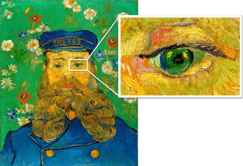
Read more on Van Gogh’s portraits here.
I am not saying Paul Smith’s portrait is bad. It is good. It is just not museum quality that I would expect from a major juried show.
So my big question is, have great innovative artists decided to stay away from the exhibition or it is the jury that threw them out?
What do you think?

Reblogged this on VINTAGE STUDENT.
Always learned so much from your posts even though I studied art history more than a decade ago as a part of my design school curriculum – it’s time to do more studying!
I see what’s not working in the BP Portrait Award Exhibition is the backfire of pseudo social commentary in art. The artists not very sure of what she or he was aiming at and the jury was lost along the ride.
The fact that most artists felt themselves lost was very clearly standing out: most of them chose to portrait either relatives or very ill people or themselves. They were afraid to step out of their comfort zone or went for obvious heart-breakers. Sad )
Well, I liked the red wallpaper. I assume a couple of Kazakhstan oligarchs would love to have their rooms decorated with that.
But remembering the comments curators have placed by the paintings in Albertina (Vienna), I’m sure it’s the judges to be blamed.
So, as a reader proposed in the comments, it’s high time to revive Salon des Refuses )
In order to understand the reason for the prevalent doom and gloom in this show perhaps you should consider what British art feels like at the moment on a larger scale. I’ve seen only one of the BP Portrait Award shows live and it struck me as fairly miserable, dry and monotonous. No dare, no new ideas, no innovation, like you said. And hyperrealism is plain boring for me. I don’t understand why people keep doing it.
Great post – thank you!
Well, there is a general slide towards pop, endless repetitions of a-la Diebenkorn abstract compositions, paintings that would be more fitting to an instagram account of a 15 yo girl, at least judging by, for instance, this: http://www.saatchiart.com/art-collection/Painting-Photography-Sculpture/New-This-Week-8-31-2015/153961/112335/view. Perhaps, the “official” show veers off towards the reactionary end of the spectrum because of the pointless decadence all around? ) Thank you!
Very nice post, really interesting.
What I wonder is why there are artists who continue to paint in the style hyperrealist? A poster photo has the same result and costs much less.
The artist who paints must be able to grasp something more than what we see in a photograph.
Good evening and many thanks for your post.
Thank you, Neda! Hyperrealism is something that impresses people easily, especially when it comes in a size that’s bigger than life. The fact it becomes replaced by the next outdoor poster in the mind of the awed observer the moment this observer leaves the gallery is of no concern to curators because people remember “it was a great show” even though they can’t remeber anything from it a week later )
That’s right. I know a hyperrealistic painter. I have asked him why he continues painting in this style. He replied that he will be better than other hyperrealistic painters more famous than he. I saw his last personel exhibition: extra-large vegetable or flowers painted on canvas with oil colours. Very good painted, really, but too much similar as photo and without any emotion.
Good afternoon Kirill, and many thanks.
I feel like sometimes with these types of competitions its a question of what came first, the chicken or the egg? Were the artists creating these kind of works because they believed that’s what the judges wanted, or did the judges choose these works because that was what was what the artists were painting? Overall I get the feeling that both the artists and the judges are playing safe. No one is trying to challenge or surprise the viewer, unless they wanted to challenge our attention span? Which sadly can happen in large institutions where they don’t want to create too much controversy. It is often in small independent galleries that more innovative works are shown.
Perhaps, you are right, but still, one of the judges is one of the best experts on Rembrandt’s portraits. How could he go with something like that? They were choosing from 4500 submissions… I still hope some artists were brave enough to send in something great.
With a judge like that you would hope! I would love to see a “salon des refuses” for this exhibition to see what was left out!
I tell you what- you’re spot on. None of the price winners here caught me in any way, whereas some of your samples did immediately. Obviously, I am in no way as educated in fine arts as you seem to be and I don’t share your admiration for Matisse or Van Gogh, but nevertheless… I usually go by the wow that gets me, if I look at something or hear something, that somehow gets deeper than the myriad of other Impression bombing me daily.
I totally stand with you on the wow principle, but I hope – over time – to help readers see the greatness of Matisse and Van Gogh, eventually )) Thank you!
thxs., see, the fact, vG used every colour in the pic in the pertraitees eyes also, was such a help.
Thank you – and as for Van Gogh, here’s a link to his landscape which I hope can be a help too! http://wp.me/p2SuQi-1I
The funny thing is my painting was rejected from the BP Portrait Award a couple years back. It was a self-portrait of me holding up my cat–wait for it now–smiling.
Yeah, I understand that in the eyes of the show’s curators or Judges all people are interesting and valuable, from all walks of life and in different state of their fragile flesh, but why should the whole exhibition be one huge crucifixion is beyond me. It is not BP, it is Prozac that should be sponsoring the show.
If I were Elisa’s parents I would love to have this portrait of her. I think from the old masters perspective their subjects tended to be people of consequence – Dukes, Dutches, Kings & Queens. In most of these cases the portraits are of everyday people living ordinary lives.
The portrait I like was Healer from Taos by Niolai Freshin. Then there is The History of Men by Milan Ivanic, which although somewhat cartoonish, is a real character study. But the real prize for me would be Sala Branca (the white skirt) by Balthus (but it was painted a long time ago 1937). I guess I’m stuck in the past somewhat too.
Leslie
I think neither of us is stuck in the past. I think we are not being offered a future by this show. As for Elisa… I, as a parent, would want her portrait to reflect not just the fact that her parents are buying dresses with sufficient extra volume for her bosom in case her breasts suddenly go a size up. I am sure she is an interesting girl full of very different expectations and dreams. I would want THAT to be in the portrait )
I found that her eyes were full of resignation and there was an expression of sadness to her appearance. She has an innocent beauty but she is almost repressed. The blouse is buttoned to the top and she wears a sweater. The young girls that I know today dress more casually.
Leslie